

KFC (Kentucky Fried Chicken) is a popular fast food restaurant chain in Singapore and globally. It has established self-ordering kiosks in Singapore to allow more efficient and higher-quality service.
This group project was created as part of a user research module in DigiPen Singapore where the goal was to create a UX-based solution for an existing product with a digital presence in Singapore in 8 weeks.
Figma
Google Forms
Google Slides
UX Design
UX Research
UI Design
Timeline
28 Aug - 28 Oct 2022
Week 1: Project Kick-Off
Week 2: Interview & Survey
Week 3: Heuristics Evaluation
Week 4: Persona Creation
Week 5: Wireframe
Week 6: Low-Fidelity Prototypes
Week 7: High-Fidelity Prototypes
Week 8: Usability Testing & Final Prototype
Project Kick-Off
Our team of five selected KFC's self-ordering kiosks as the product we wanted to re-design. We conducted background research on the product brand and gathered as much information as possible.

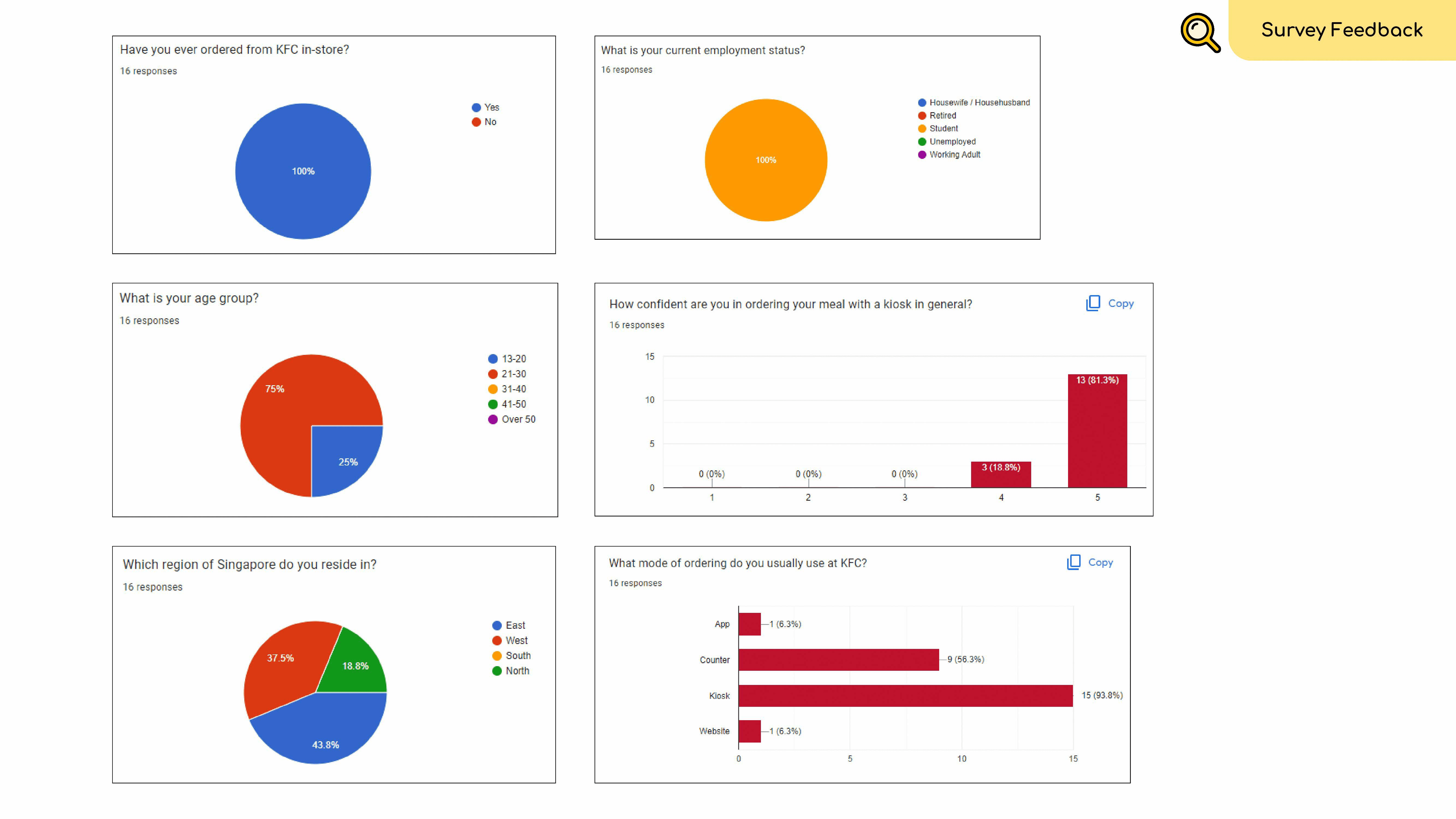
Interview & Survey
Through interviews and surveys, we gathered feedback from diverse user groups, specifically working adults, students aged 13-19, and homemakers to identify key insights about their experiences with KFC's kiosk interface in Singapore.


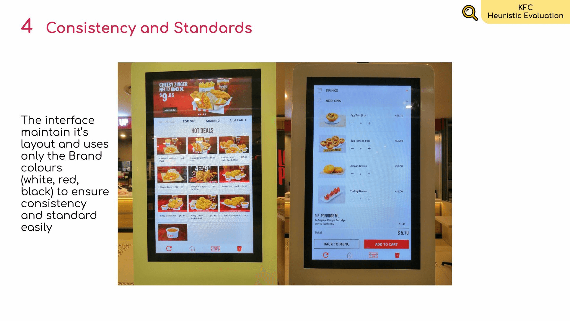
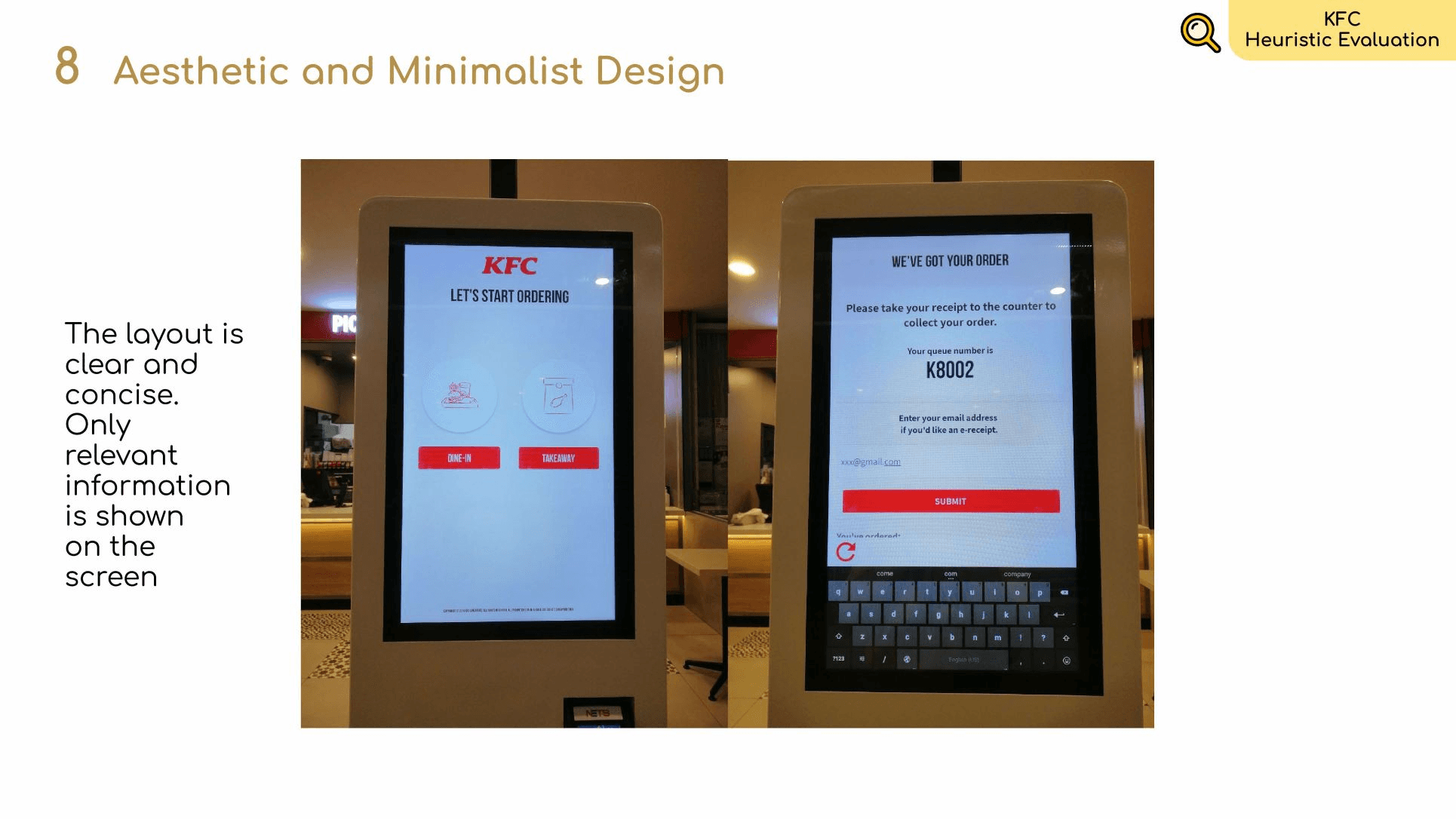
Heuristics Evaluation
We conducted a heuristic evaluation on the current kiosk interface to evaluate its usability quality. This assessment helped us to identify and maintain elements which were working well and improve the user experience by addressing the identified usability issues.
The heuristic evaluation was conducted by following Jacob Nielsen's 10 Heuristics for User Interface Design framework.


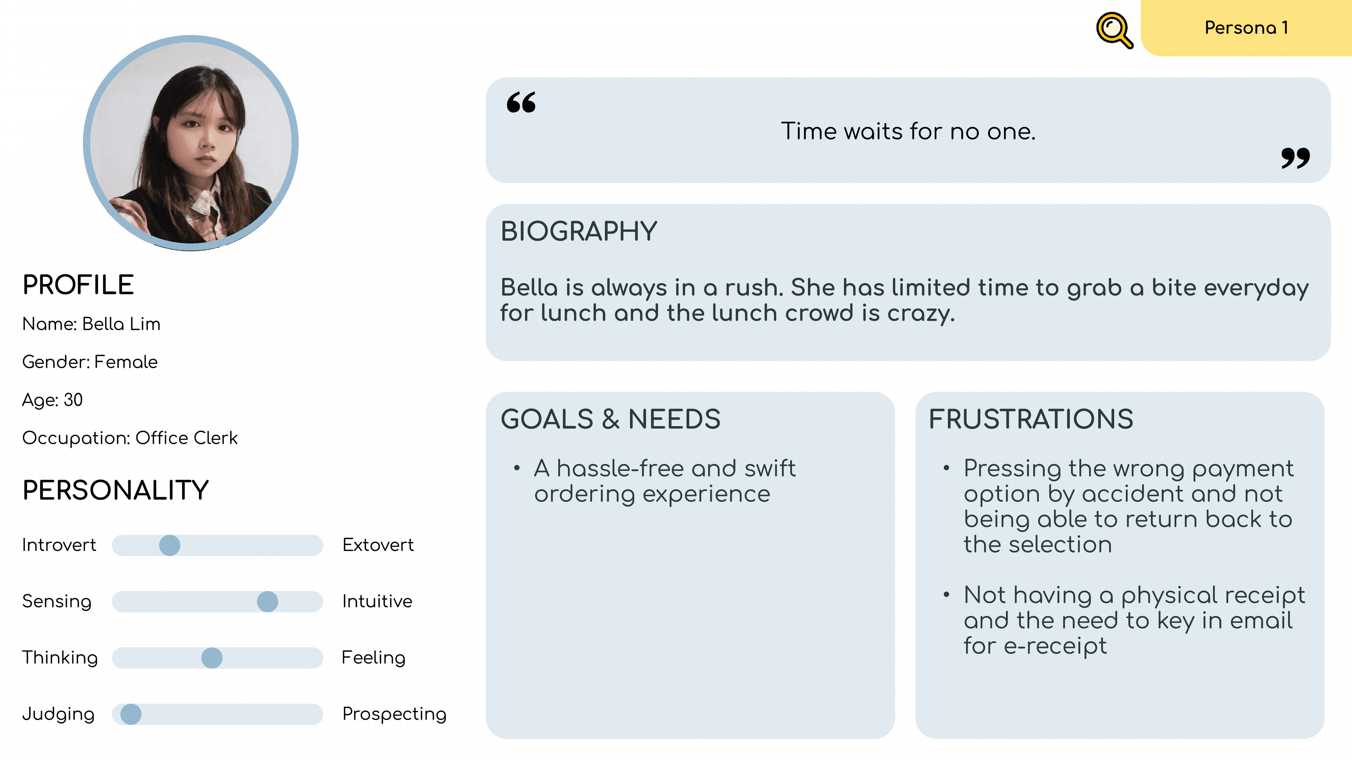
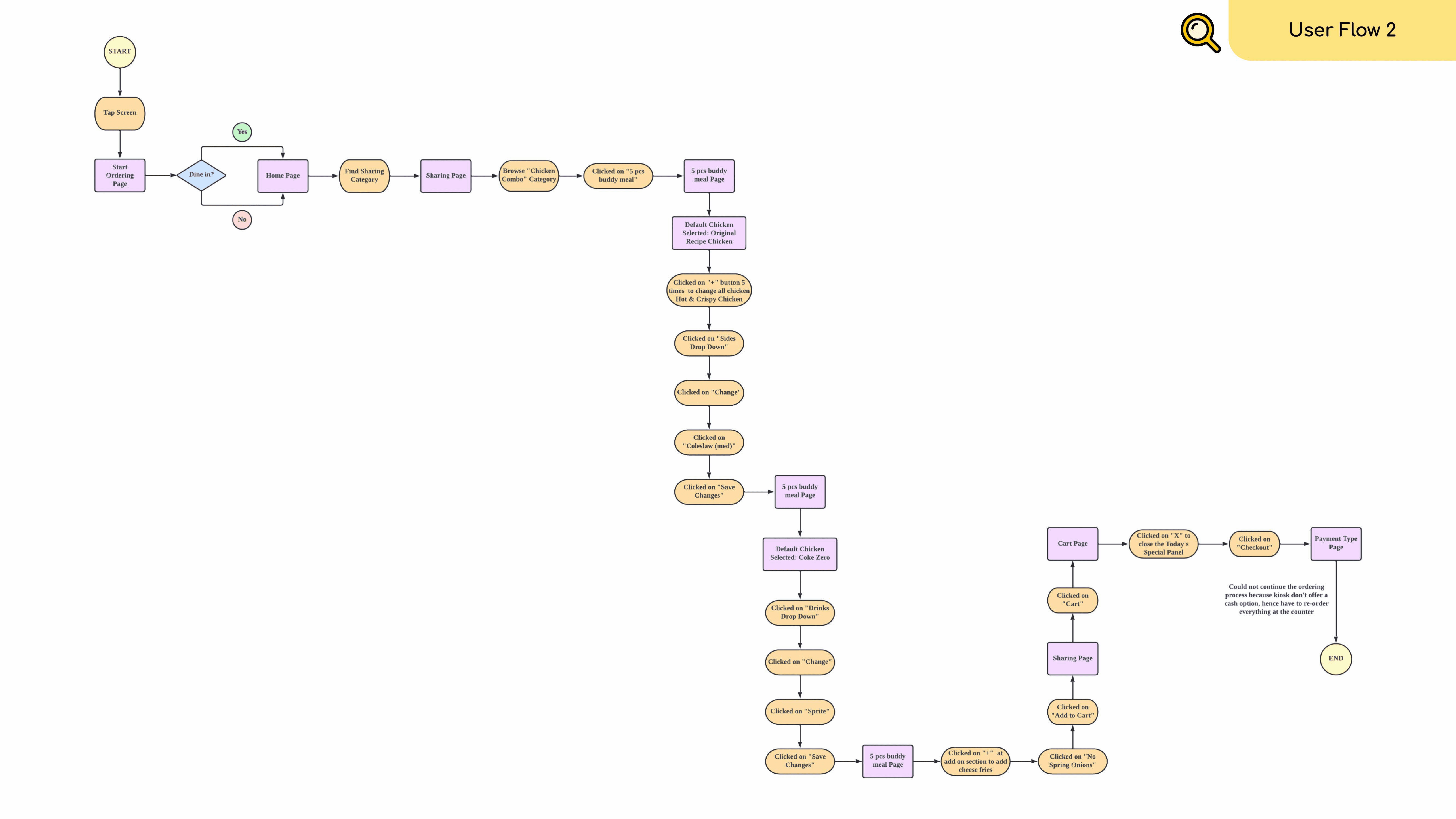
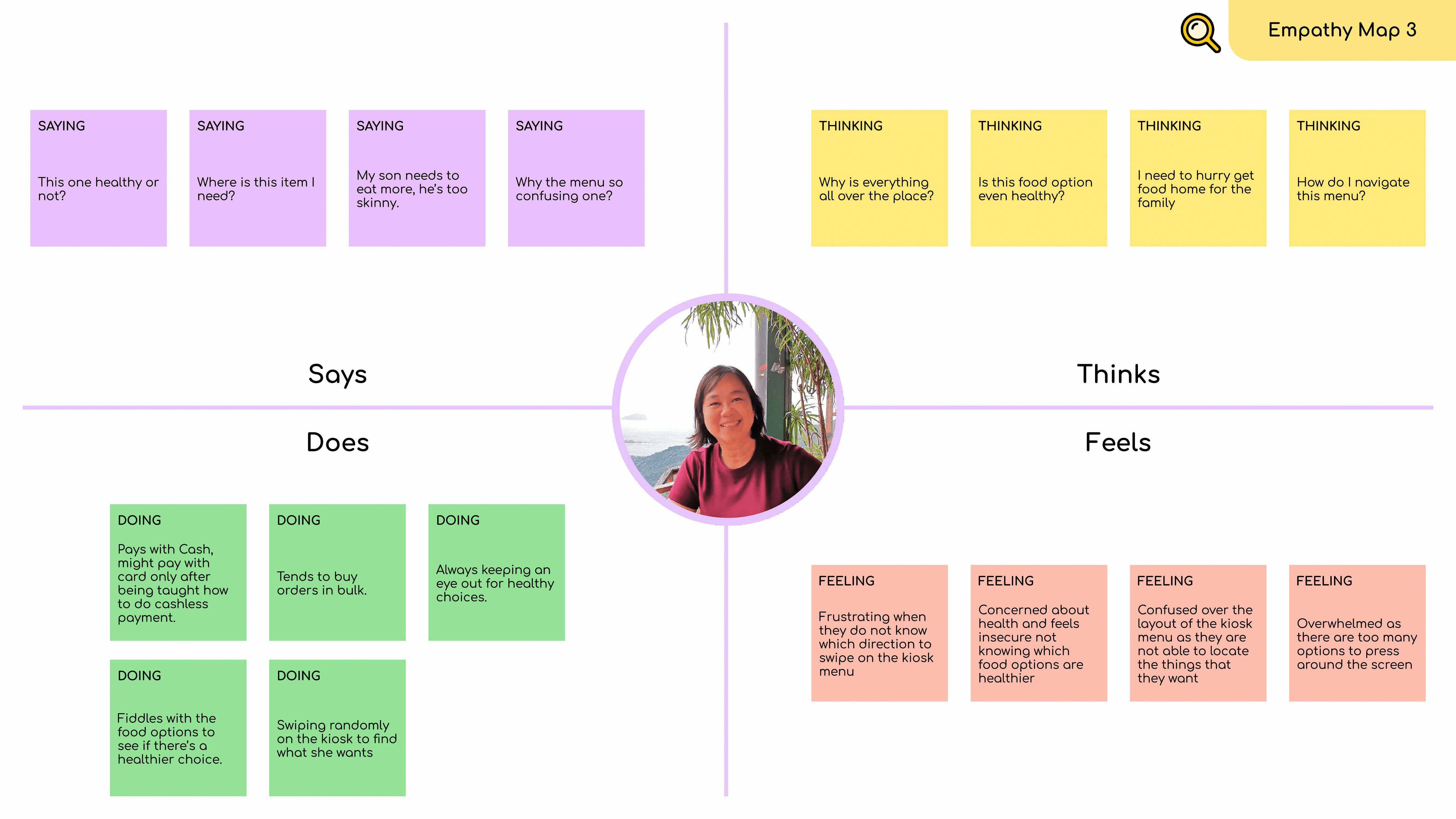
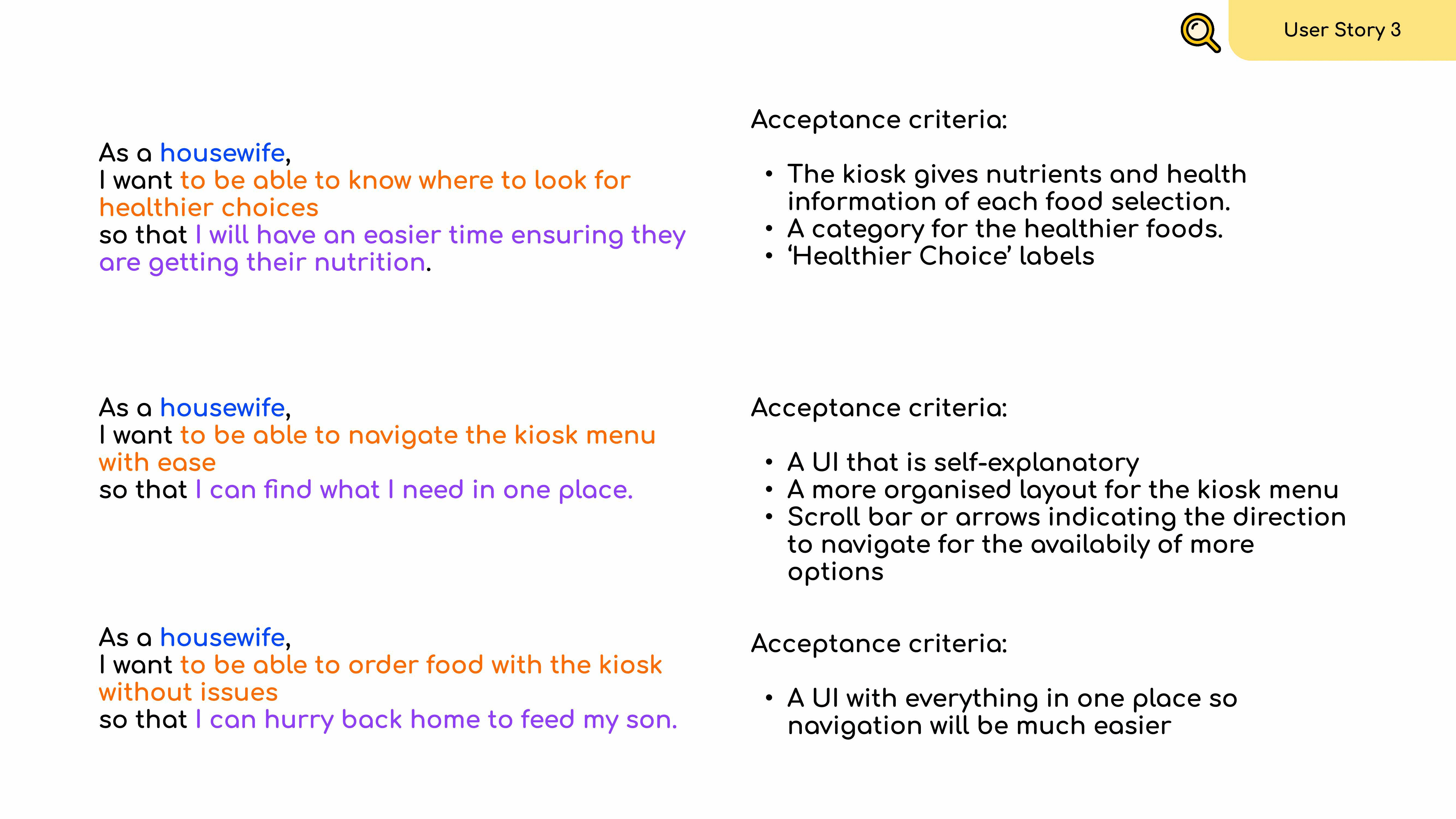
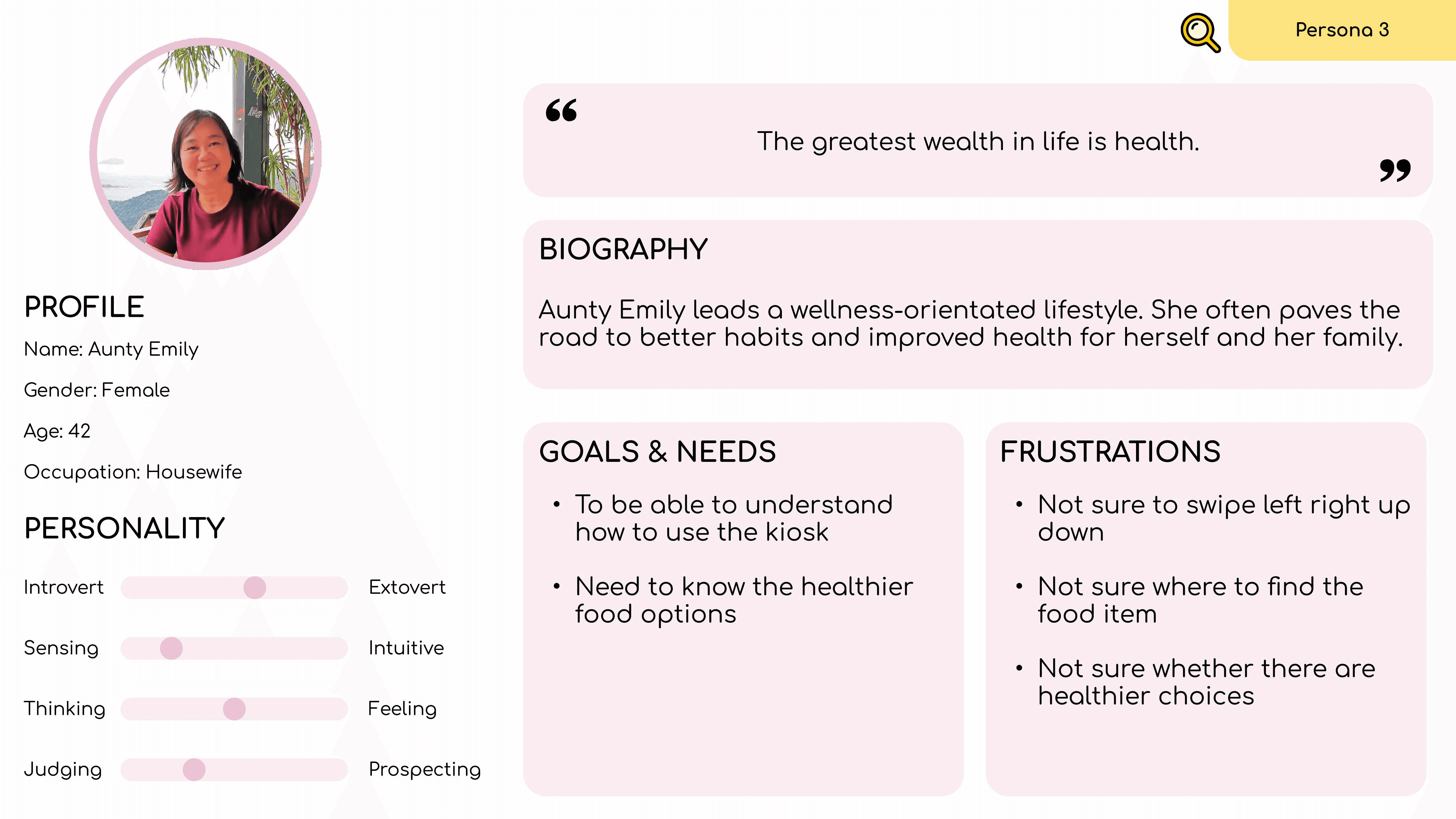
Persona Creation
As mentioned earlier, we are mainly focusing on 3 user groups, which are working adults, students aged 13-19, and homemakers.
We wanted to form a deeper understanding of the user's goals, needs, experiences, and behaviours. So, we created an empathy map, a user story, a profile, and user flow for each of the user groups. We used these personas whenever we wanted to step out of myself and reconsider our initial ideas.


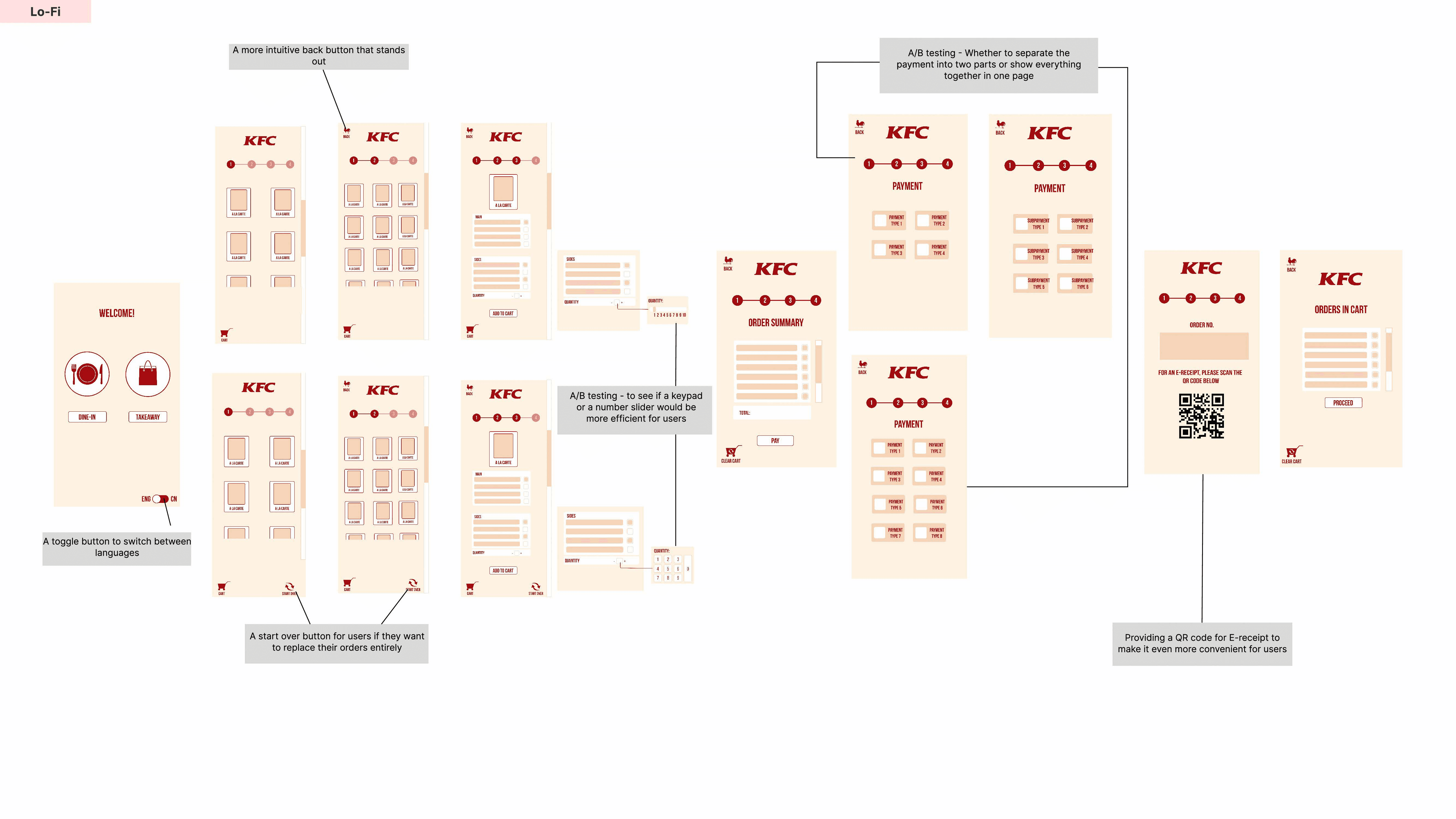
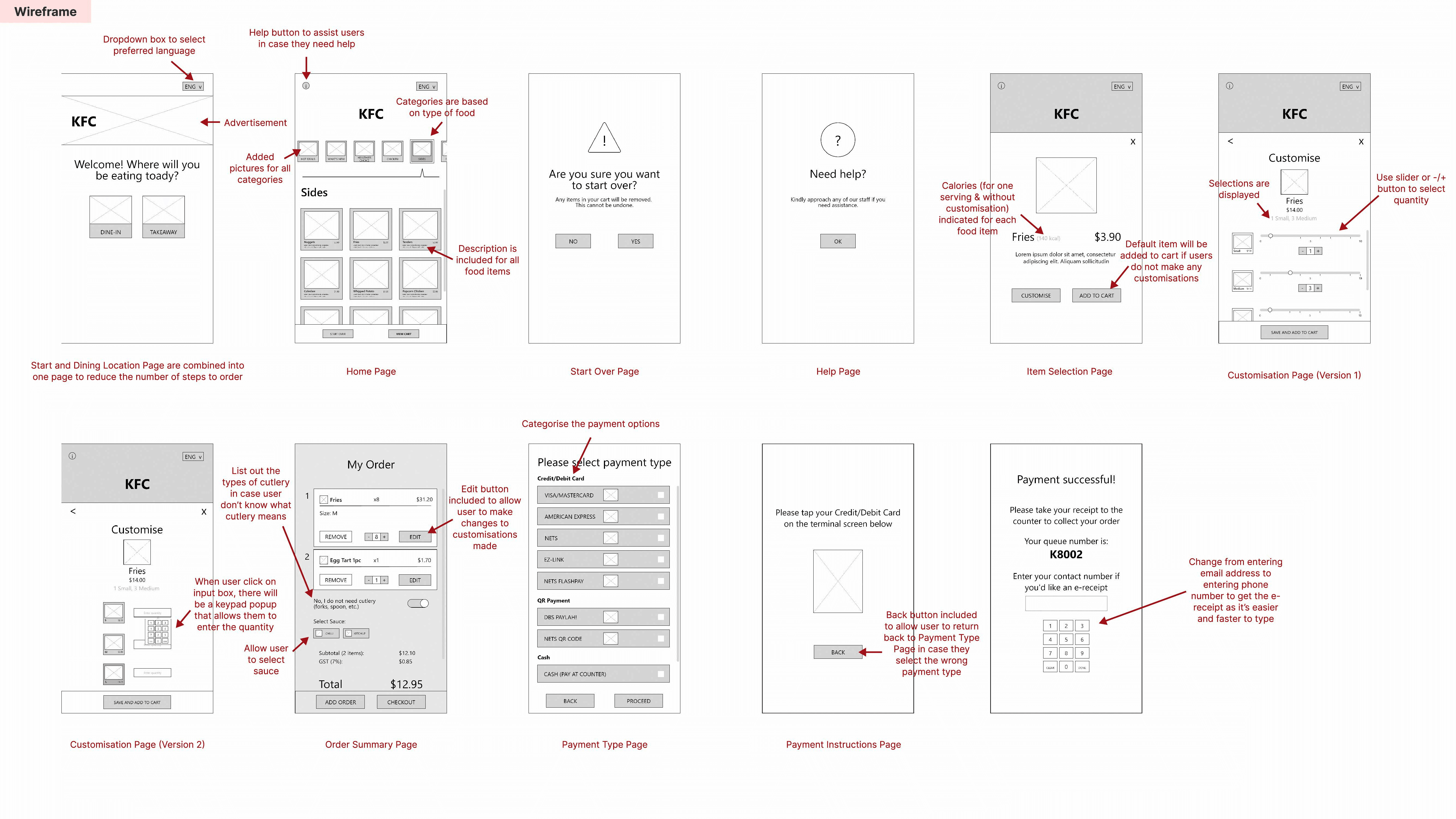
Wireframe, Low-Fidelity & High-Fidelity Prototype
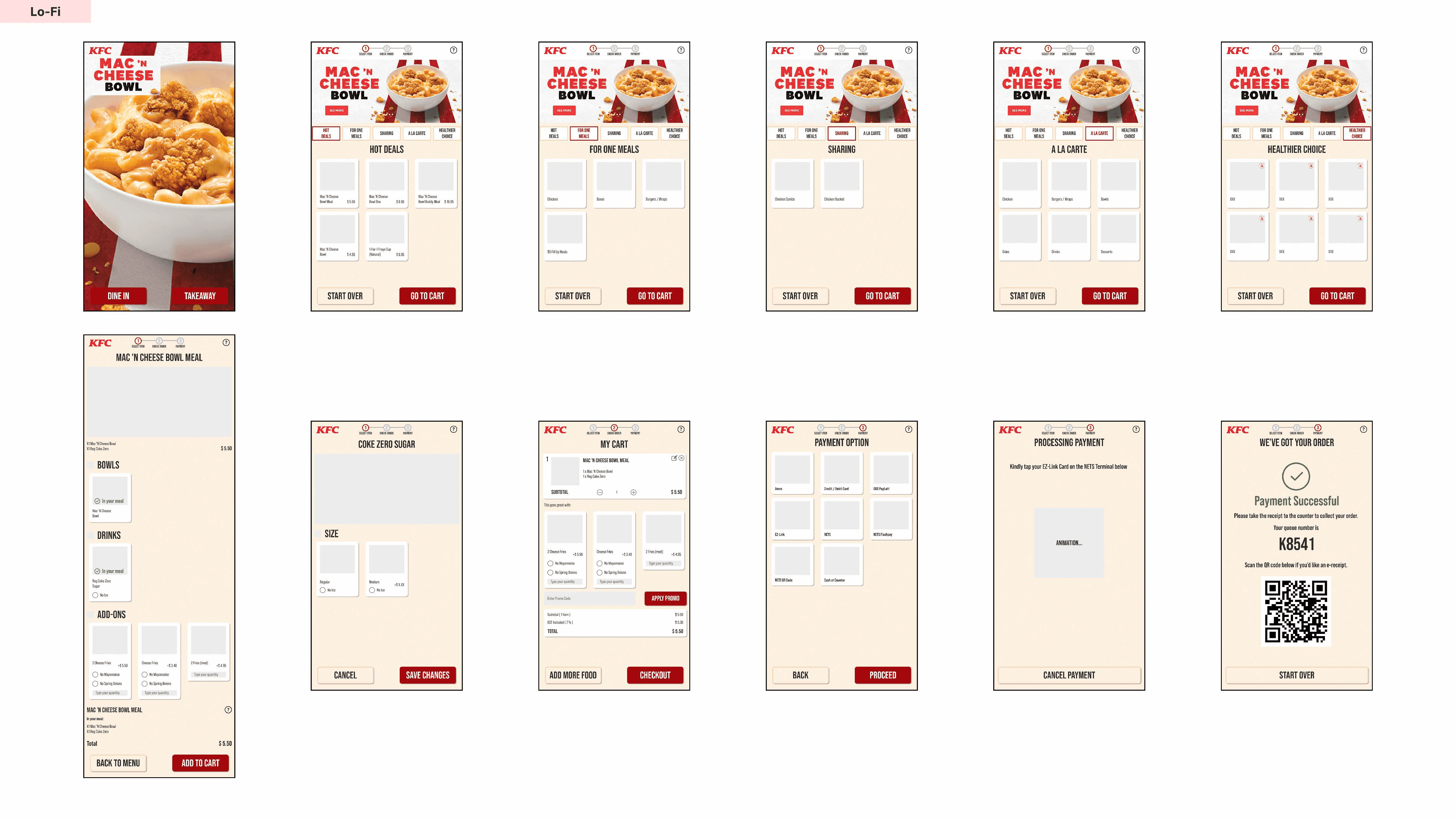
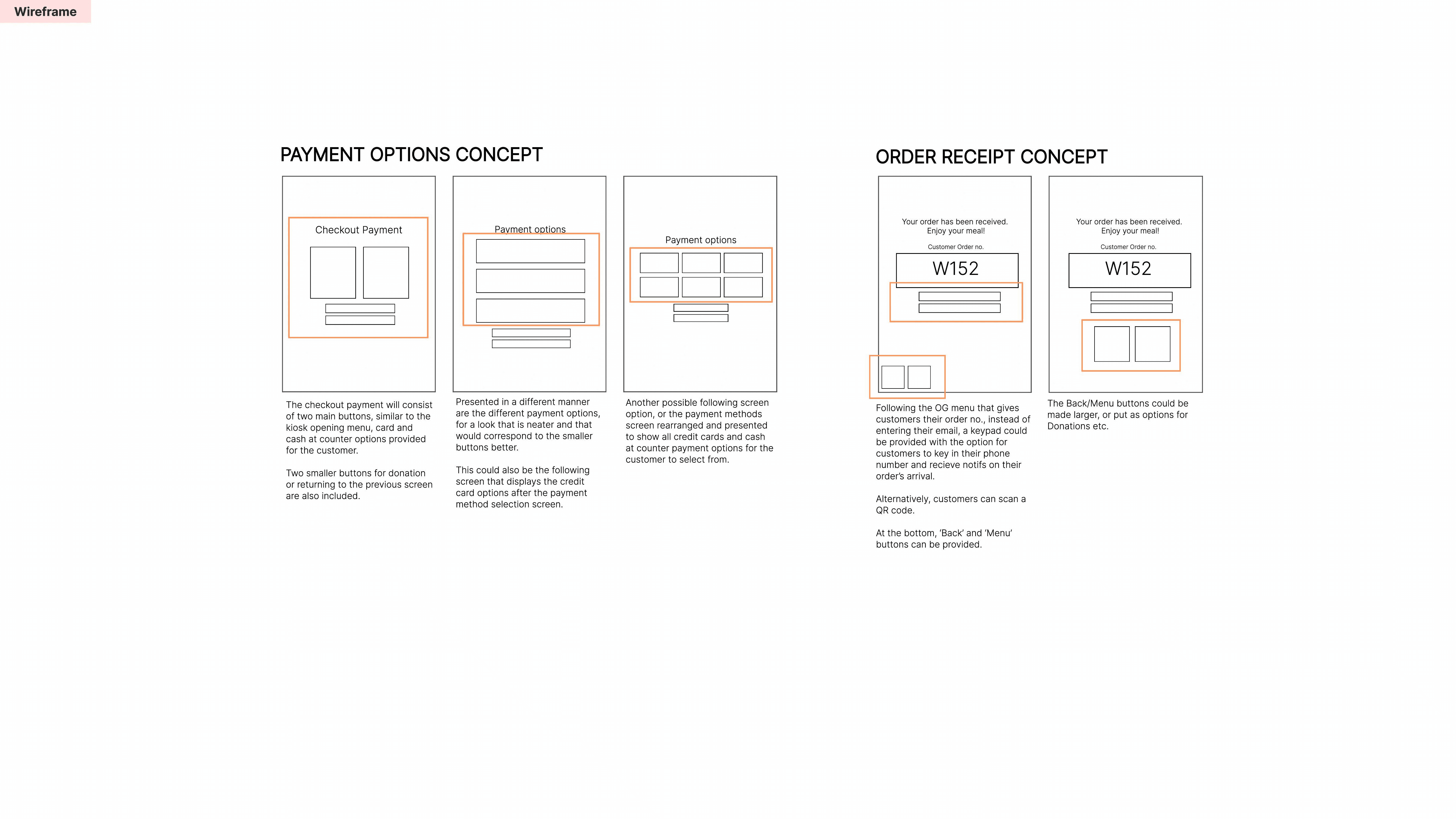
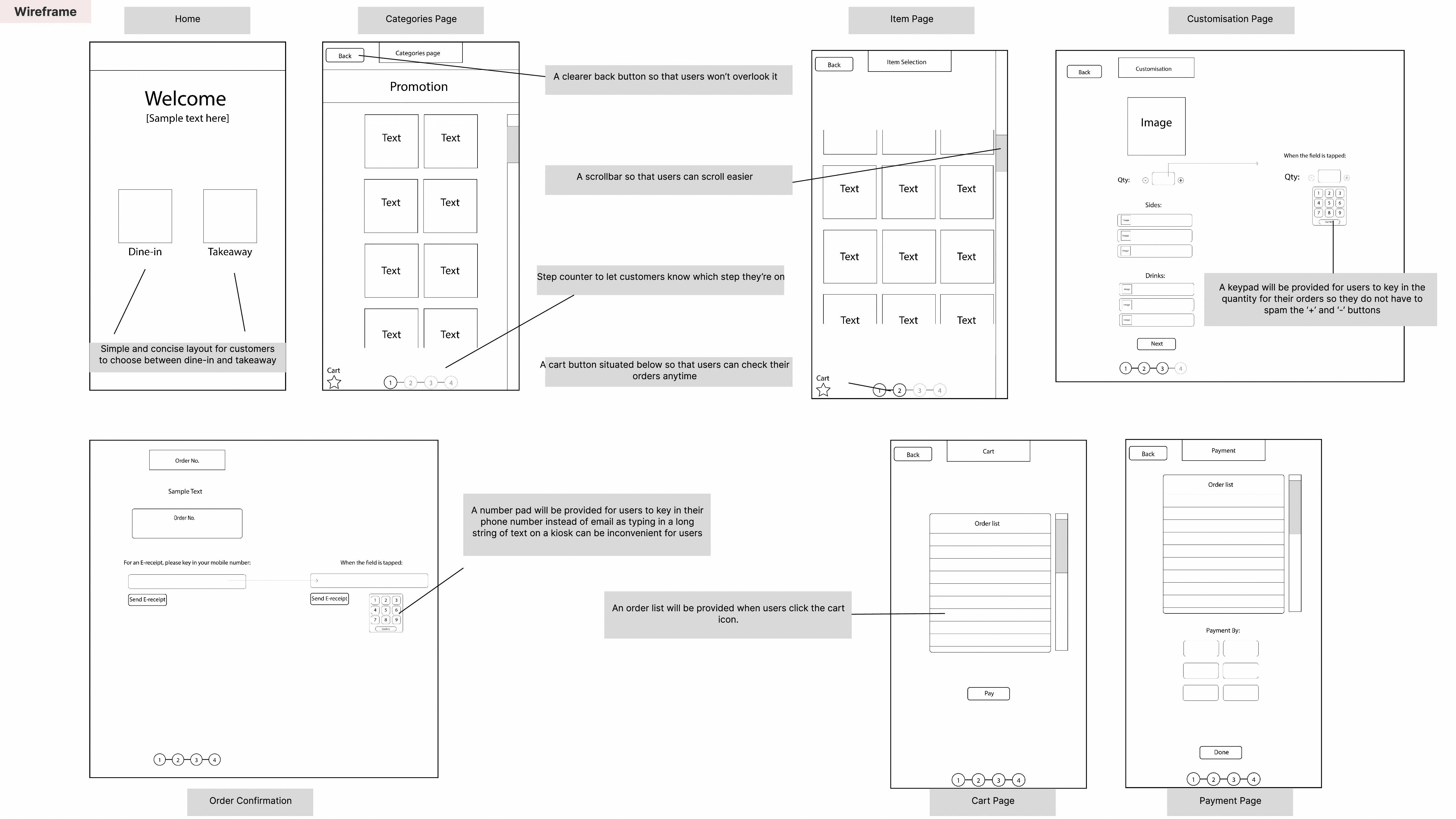
To address the identified issues and implement suggested improvements, we developed solutions through an iterative design process. Each team member began by creating individual wireframes in Figma. We then progressed to low-fidelity prototypes, which allowed us to test basic layouts, user flows, and navigation patterns.
Subsequently, we each developed detailed high-fidelity prototypes with full interactivity. Then, we gathered the elements we liked from each team member's prototype, resulting in a unified solution, a single prototype, that captured our best ideas.


Usability Testing & Final Prototype
We conducted a total of 9 A/B tests through an online survey and shared the survey in various relevant communities. For each test, there were 2 different variations of a specific element of the high-fidelity prototype, and respondents had to decide which version they believed performed better for the targeted user groups. In just a few hours, we received about 50 responses.


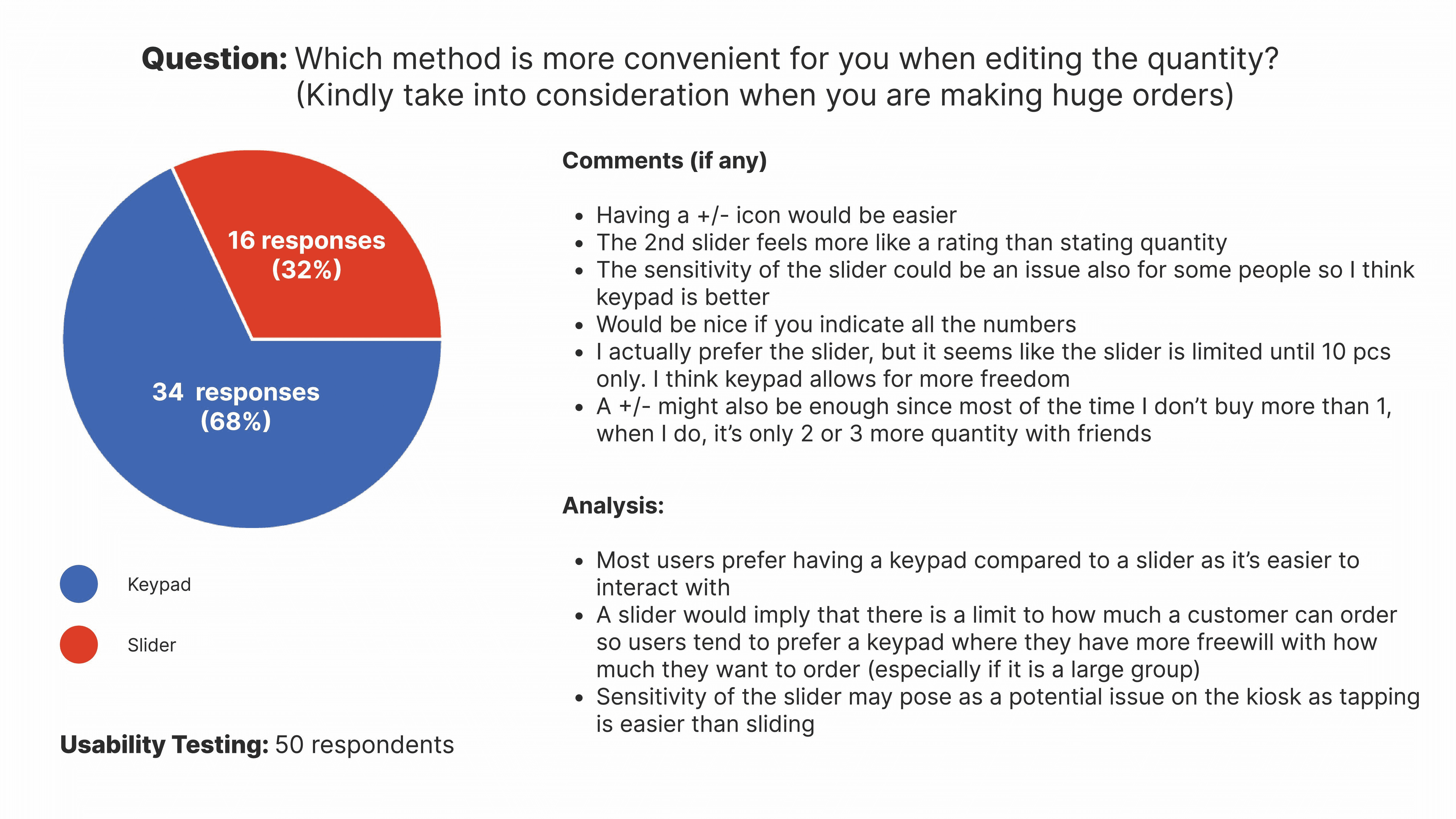
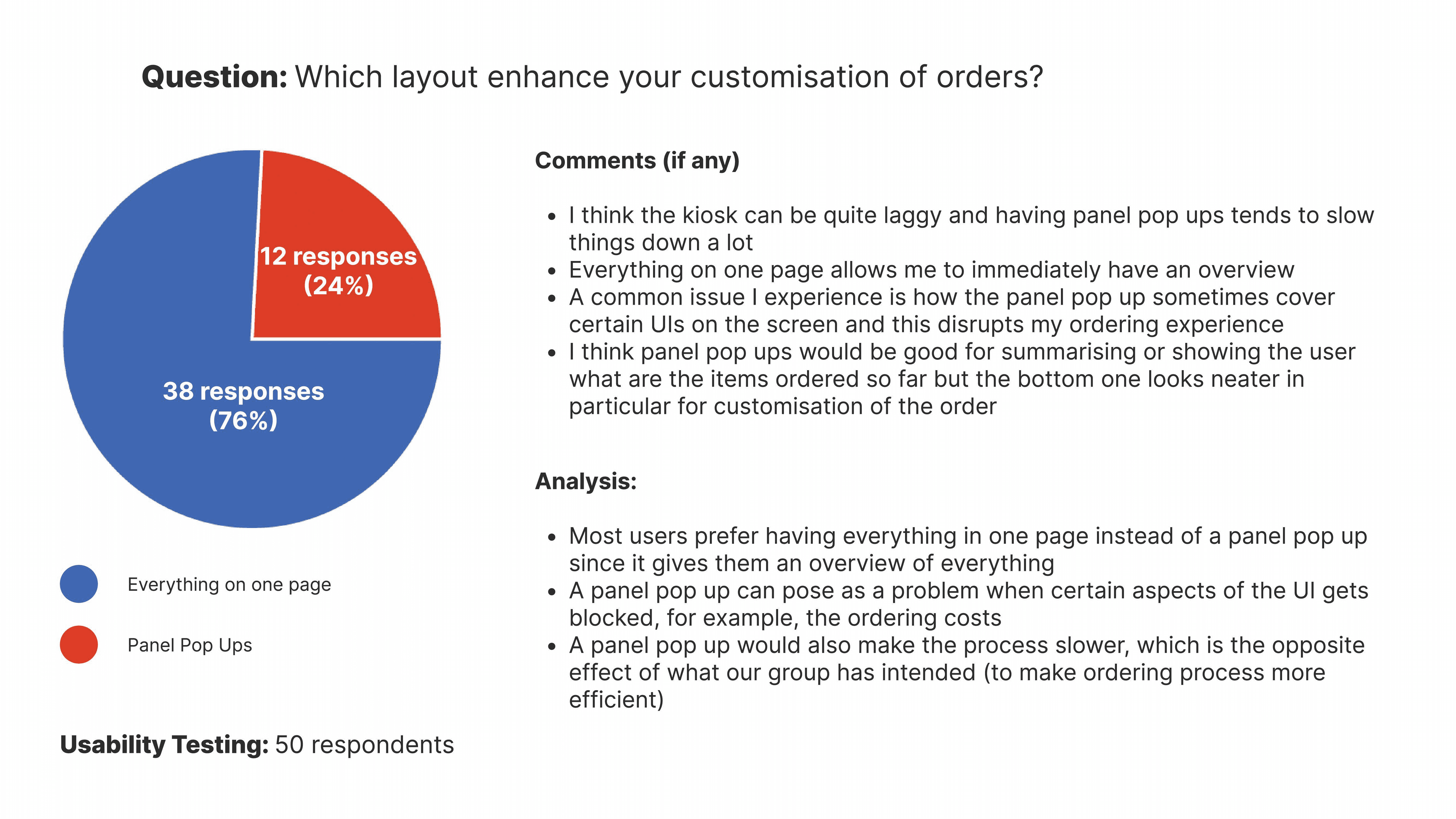


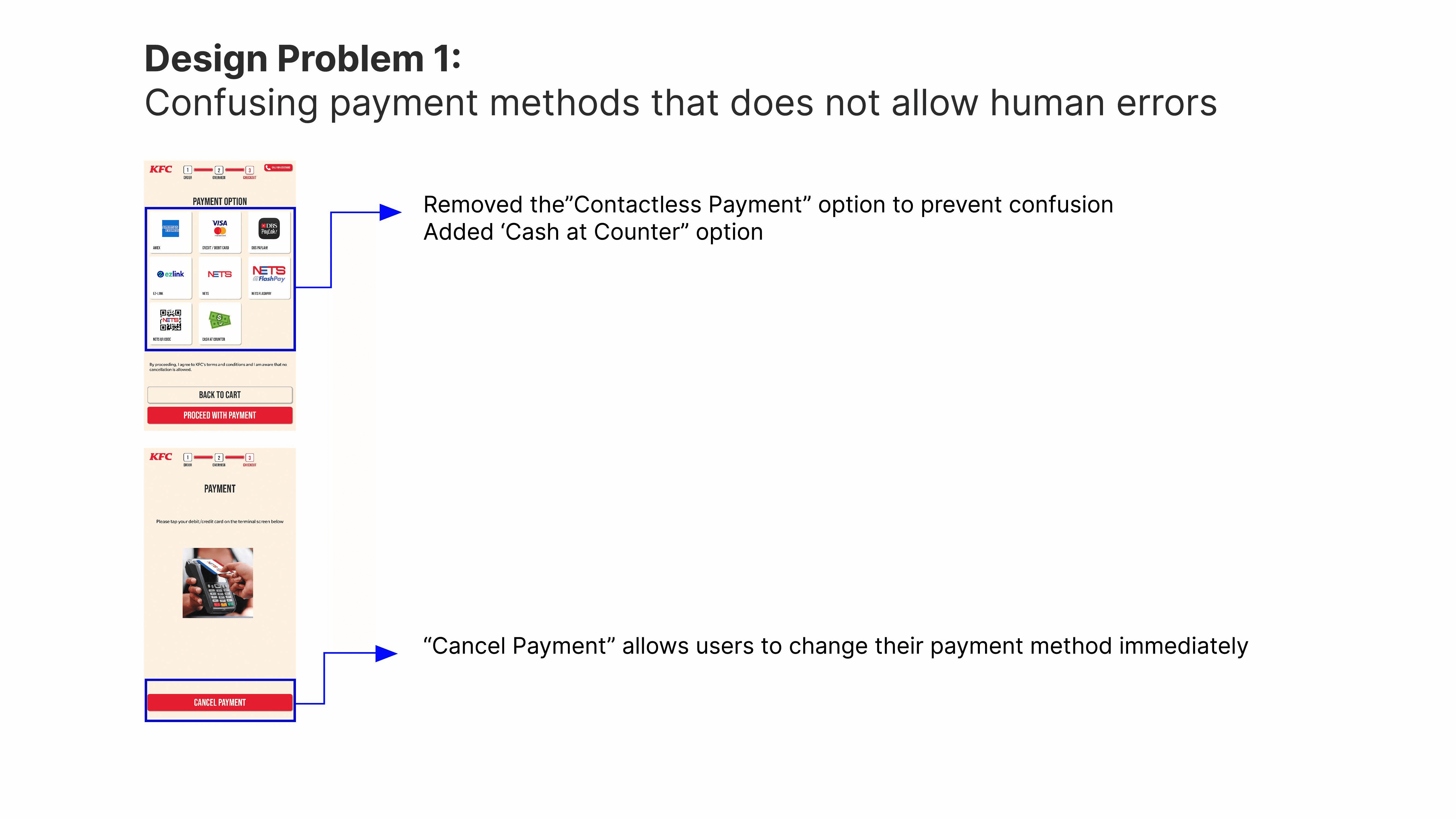
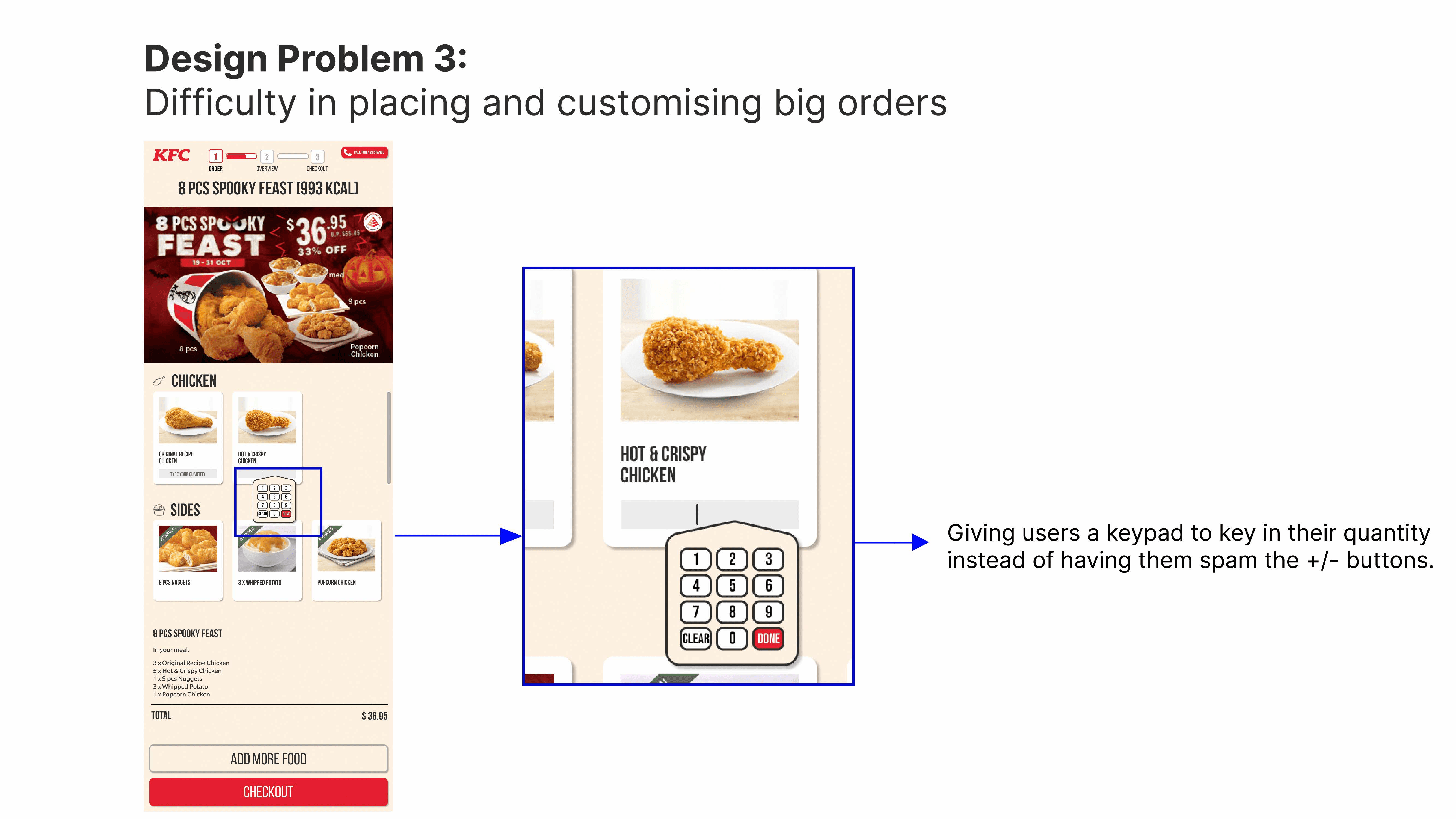
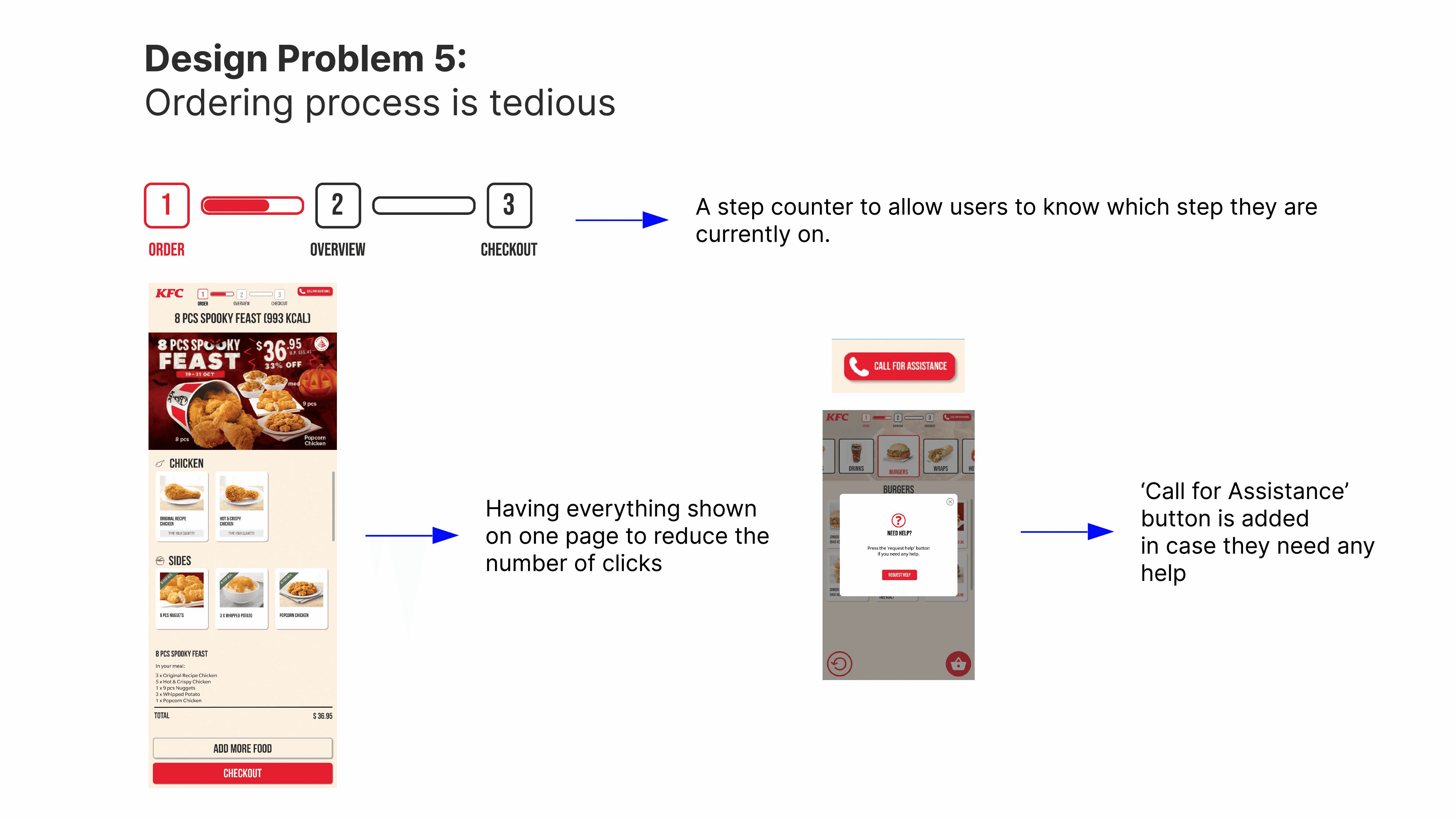
According to the responses, we made alterations to the high-fidelity prototype. Our final high-fidelity prototype has addressed the following design problems:


Conclusion
Overall, it was an enjoyable experience working as a team for this project. I liked that each of us had done our own versions of the wireframes and prototypes, as this allowed us to explore variations and deliver a better end product. I felt that we also did well in gathering a good number of respondents and conduct thorough usability testing. However, I believe that we can do better on the UI as it looks a little cluttered personally.
Takeaways
Don't assume.
Sometimes “problems” that we think exist about the current interface design may not be actual problems that users face. Hence, it is very important to conduct thorough interviews and surveys from users, and evaluate their feedback accurately.
Understand the priorities.
Heuristic evaluation should have a severity or impact metrics to determine how serious the problems are. By understand the severity of each problem, we know to prioritise addressing problems that are the most critical. This will allow us deliver a product solution more efficiently.
Always better to have more ideas.
By creating wireframes and prototypes individually, we can gain diverse perspectives. This allows us to generate more creative solutions and lead to a more robust outcome.