
PlayWave is a music streaming mobile application with a minimalistic and modern design. It is designed to help people, especially the younger generation, unwind and relieve stress.
This individual project was created as part of a user experience design module in Digipen Singapore where the goal was to create one interactive prototype for a digital application for mobile with around 11 individual screens within 5 weeks.
Adobe XD
UI Design
UX Research
Timeline
4 Mar - 8 Apr 2022
Week 1: Project Kick-Off
Week 2: Style Guide
Week 3: Mockups
Week 4 & 5: Interactive Prototype
Project Kick-Off
As the purpose, target market, and features of the mobile application were up to me, I brainstormed a few ideas. Out of the ideas I came up with, I decided on creating a music streaming platform that is targeted towards Gen Z. I often use music streaming platforms such as Spotify, and I belong to the targeted generation group. Thus, I believed that it would be easier for me to empathize with and understand the users' problems on a deeper level.
Concept Summary: A music streaming application for mobile called PlayWave that allows users to listen to millions of songs and create personalized playlists. Provides a seamless and consistent experience with minimalistic and contemporary design.
Target Users: The target users are Gen Z born between 1997 to 2012. As they value high productivity, have short attention spans, and are prone to mistakes, the application is designed to be succinct and make actions reversible.
Style Guide
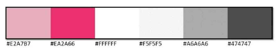
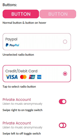
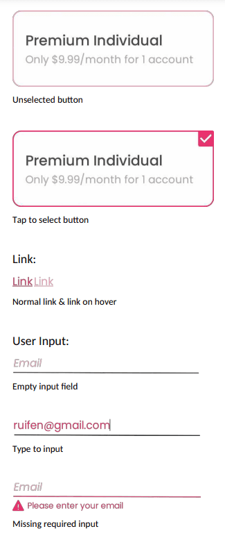
To keep the appearance of PlayWave consistent, I created a style guide. The style guide includes iconography, color swatches, typography, and UI elements.
White for the background, black for texts & pink for interactive UI elements
Fewer colors were used to keep it simple and minimalistic
Pink gives a positive and comfortable vibe
Poppins font is highly readable
Looks great regardless of whether it is a heading or body

Very simple
Pink fill without outlines


Mockups
After creating the style guide, I moved on to create example mockups of each screen to visualize how PlayWave would look like.
It includes the following screens:
Login
Sign Up
Home
Profile
Settings
Songs Selection
Explore
Liked Songs
Your Library
Playlist
Premium
Premium Checkout
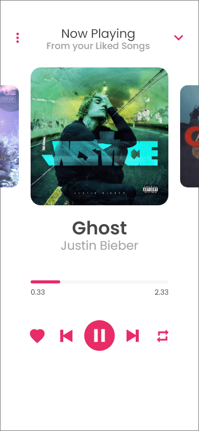
Interactive Prototype
Finally, I created a functional high-fidelity prototype with a usable interactivity flow and animations, which closely reflected my vision for the final product. After polishing the UI, I wrapped up the project.
Conclusion
Through this project, I have gained a much deeper understanding of UI and UX design. I have learned that both UI and UX design play an essential role in satisfying the needs of users.
Takeaways
Consistence is key.
A consistent, predictable user interface design results in a better user experience, hence, designers should always follow the style guide.
Always keep the users' problems in mind.
I realized that sometimes I would go off track, which might result in creating a product that doesn't solve the users' problems. Hence, I always tried to put myself in their shoes.
Design must be usable.
Although aesthetics are fairly important, designers should focus on ensuring that users are able to achieve their goals with satisfaction and effectiveness when using a product.