
Relive is a mobile application designed to help the elderly with dementia recognise people. Family members and caretakers can also use the platform to create personalized quizzes for them and track their progress.
This individual project was created as part of a user research module in DigiPen Singapore where the goal was to design a simple mobile application or website that can offer solutions to the selected group of users chosen in 3 weeks.
Adobe XD
Google Forms
Google Slides
UX Design
UX Research
UI Design
Timeline
4-25 Nov 2022
Week 1: Research, Heuristic Evaluation & Persona Creation
Week 2: Wireframe & Low-Fidelity Prototype
Week 3: Usability Testing & High-Fidelity Prototype
Research
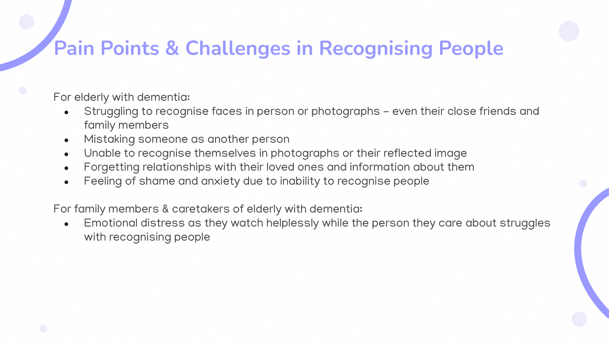
After selecting the elderly with dementia as my target user demographic, I explored the challenges and difficulties they, along with their family members or caregivers, encounter in their daily lives.

Heuristic Evaluation
I conducted a heuristic evaluation on an existing mobile application called Memory Lane Games, which is similar to the app that I designed, to draw inspiration from its design and create a better version of it with ReLive.
This evaluation was conducted using Jacob Nielsen's 10 Heuristics for User Interface Design framework.


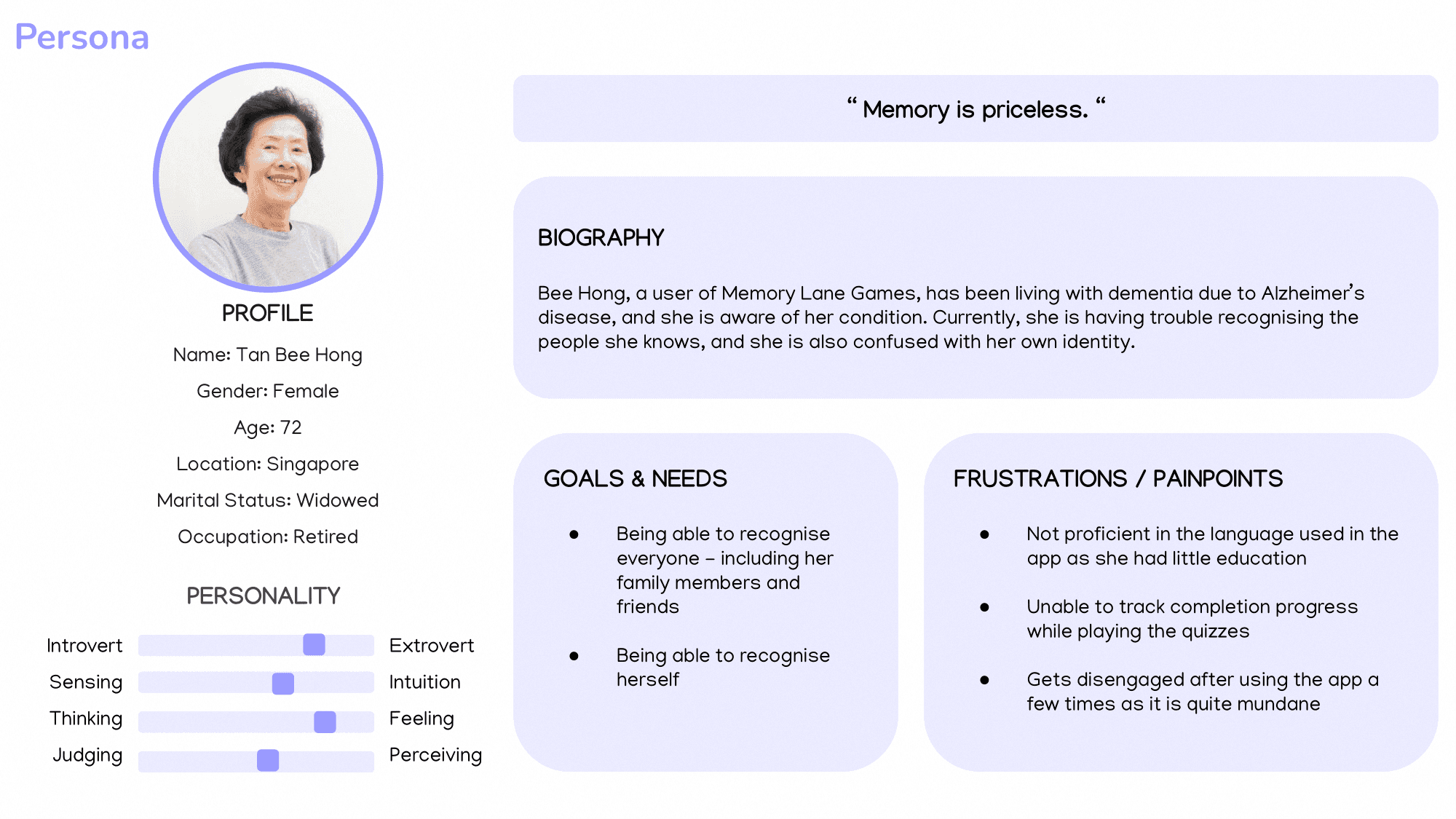
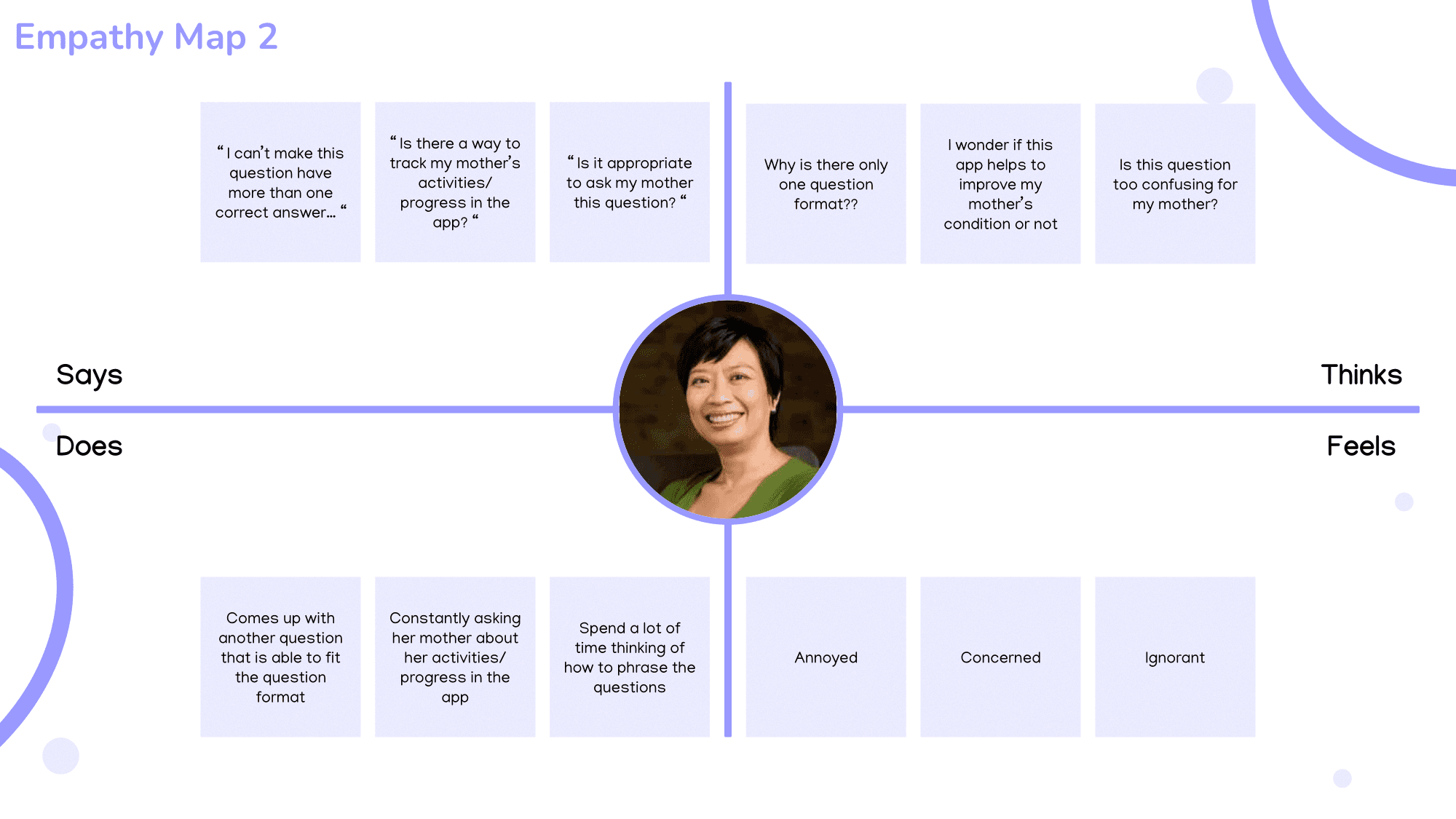
Persona Creation
The primary user group for ReLive is the elderly with dementia, and the secondary user group is their family members or caretakers who will assist them in using the app.
To form a deeper understanding of their goals, needs, experiences, and behaviours, I created a persona, empathy map, user story, and current-state user journey map for each user group.


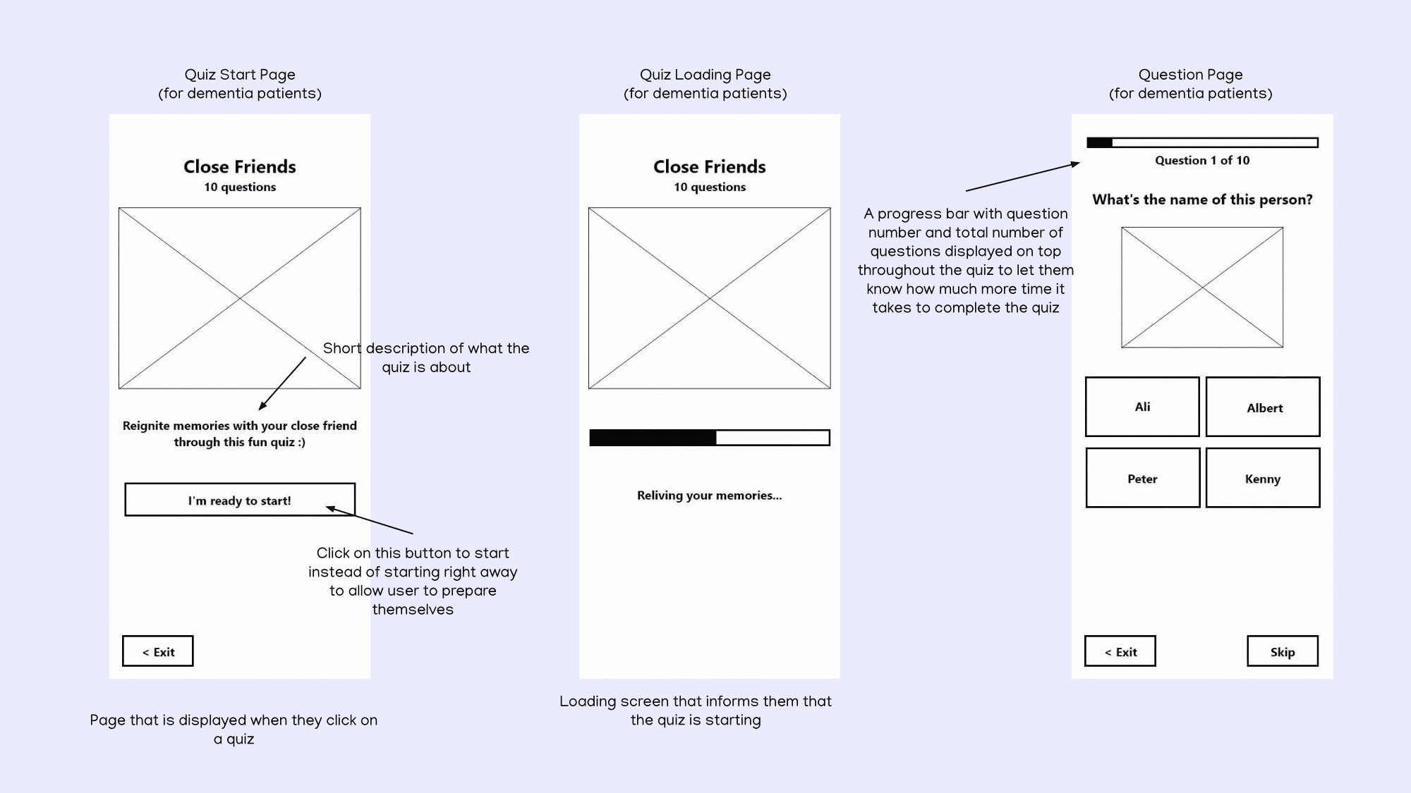
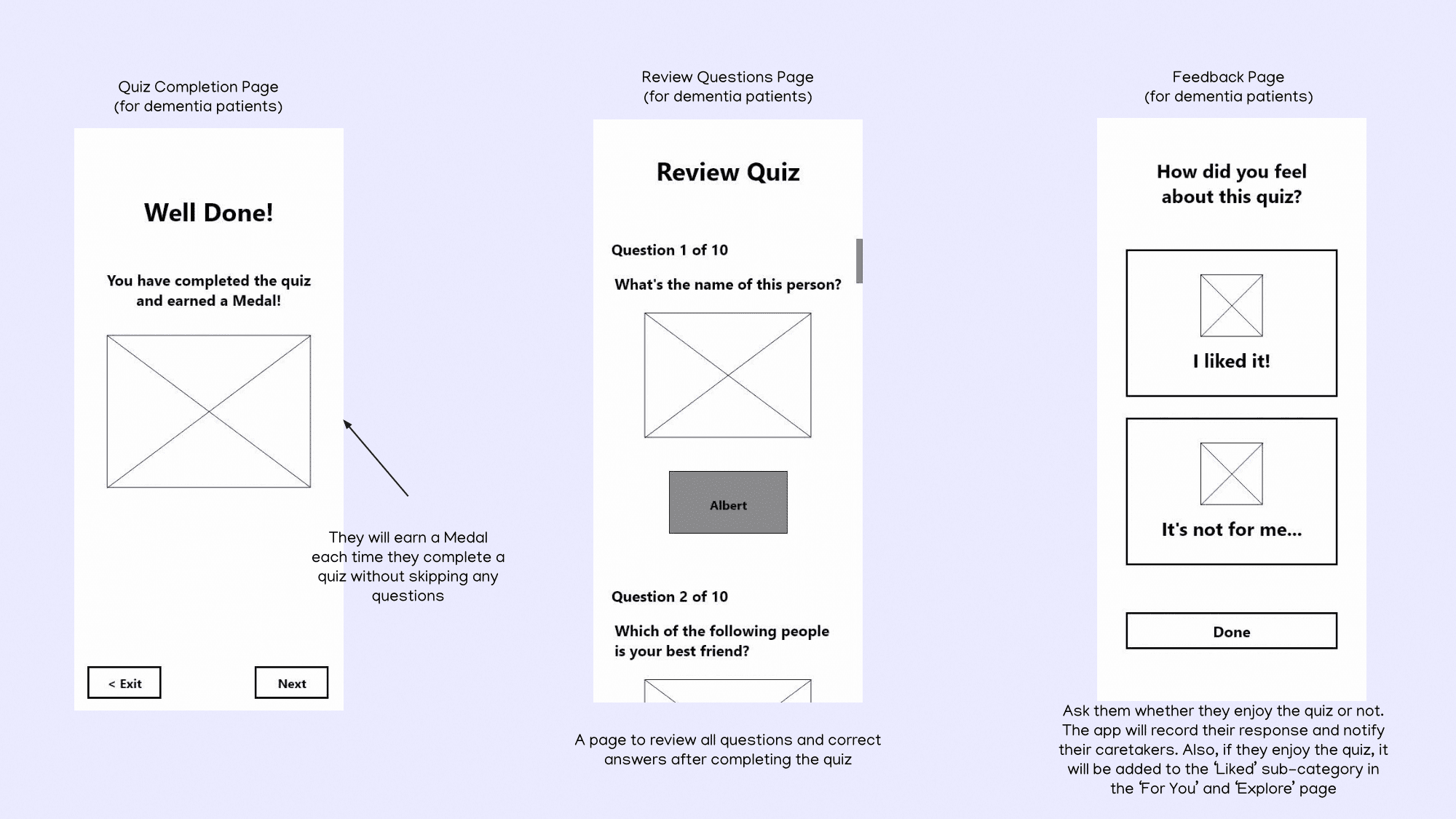
Wireframe
To quickly outline the layout, structure, and functionality, establish a clear hierarchy of content, and address the identified problems and suggested improvements, I created wireframes.


Low-Fidelity Prototype
To visualise user flows and test the navigation experience, I created a low-fidelity prototype.

Usability Testing & High-Fidelity Prototype
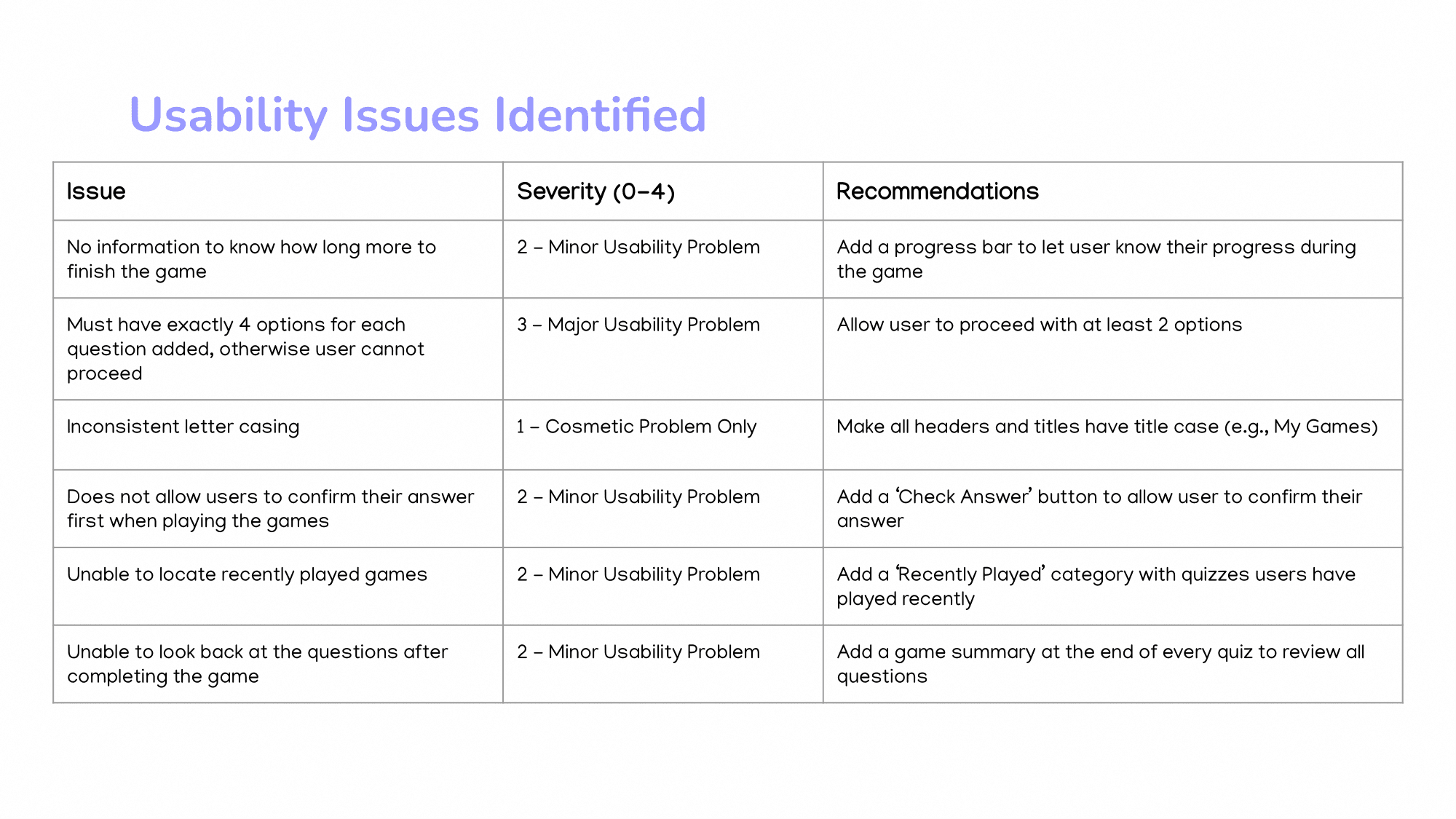
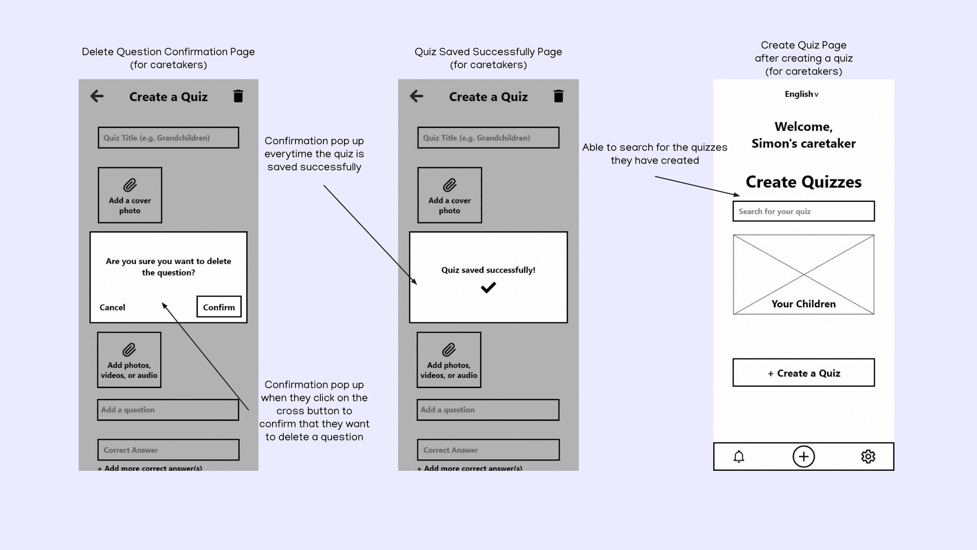
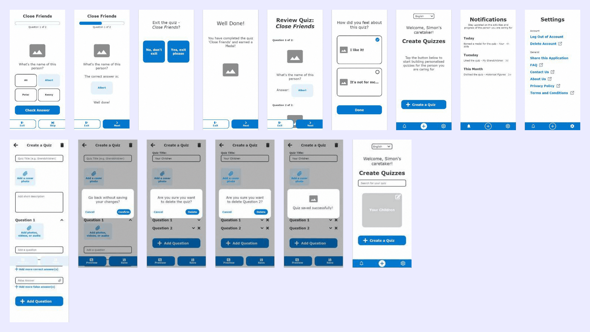
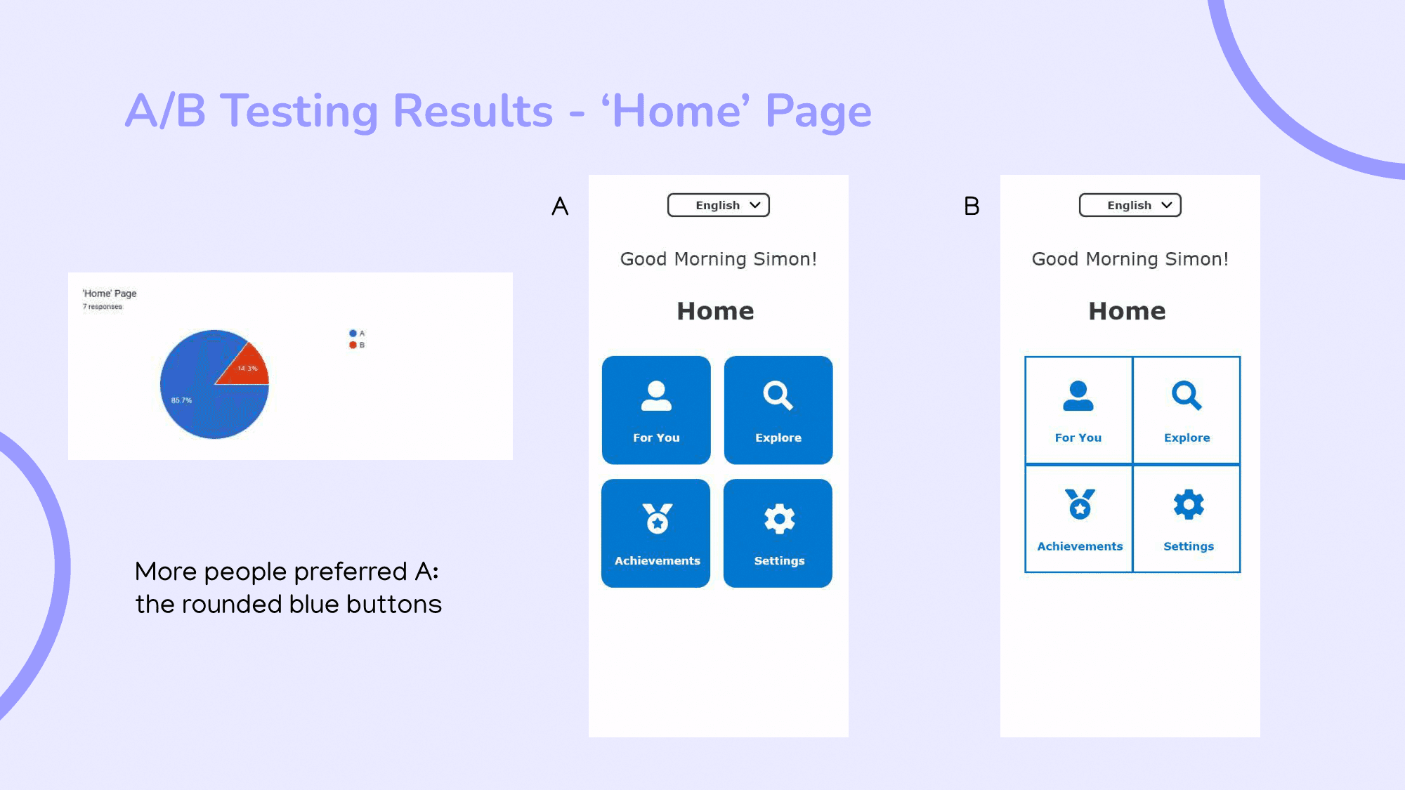
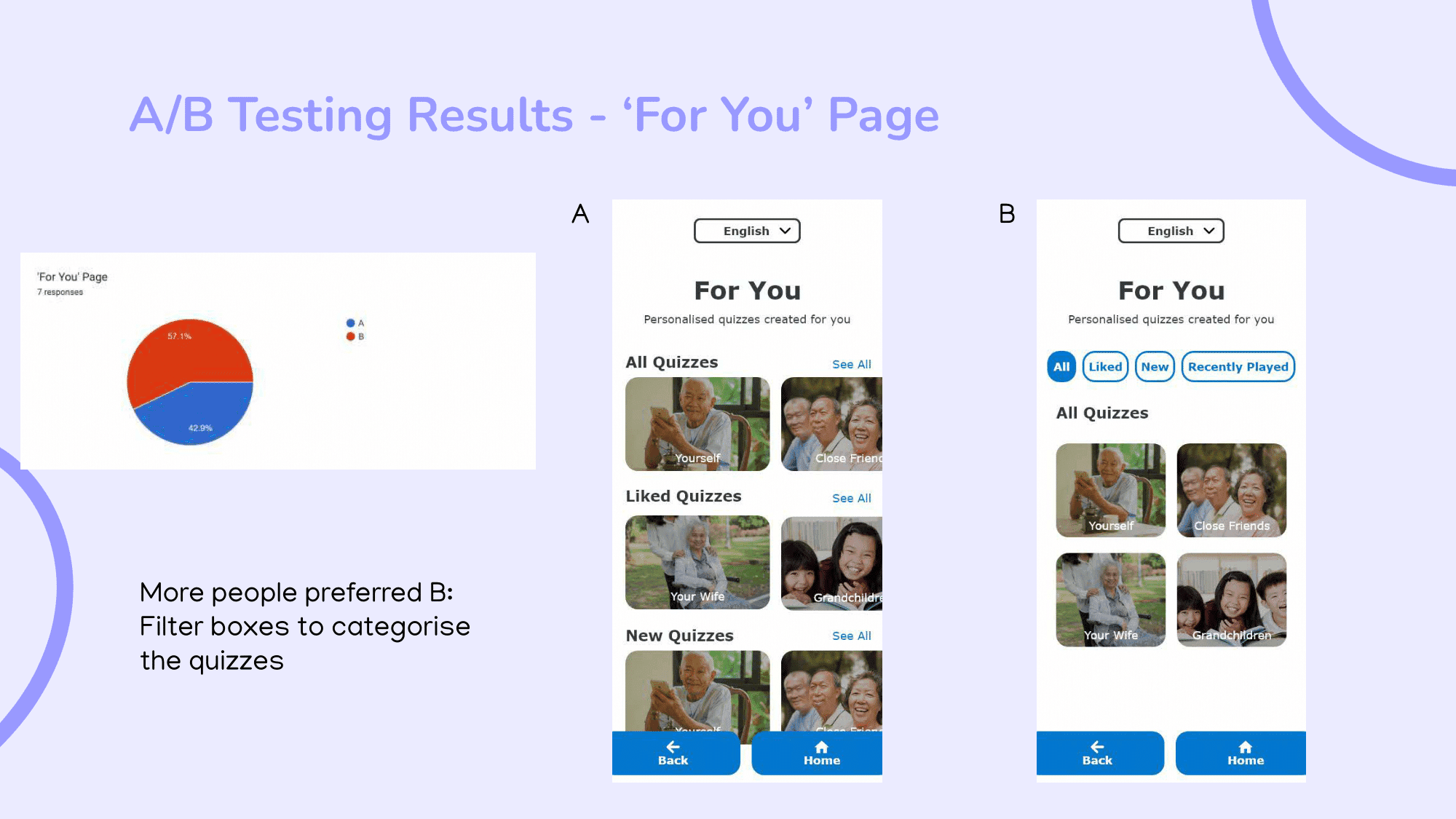
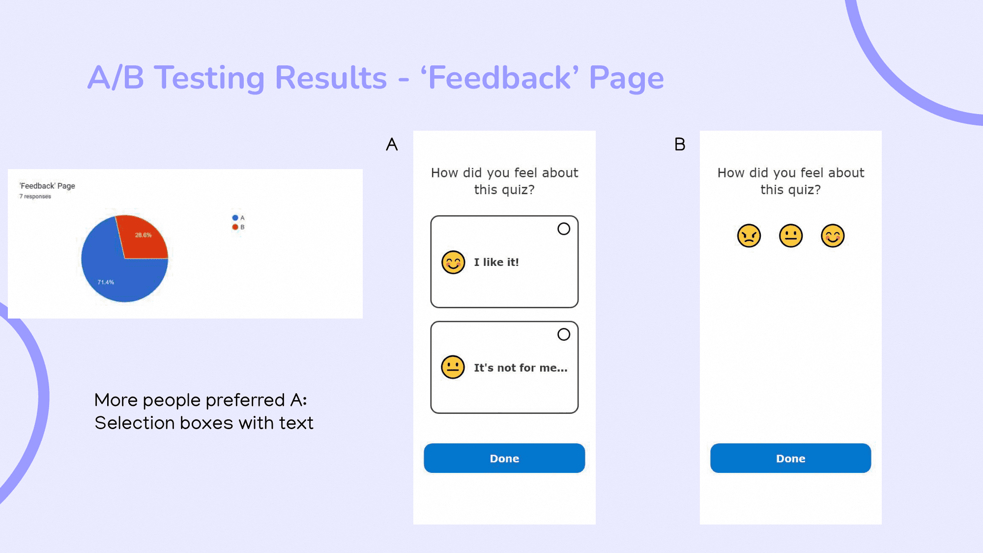
Following the low-fidelity prototype, I created a fully functional and interactive high-fidelity prototype. At the same time, I conducted a total of 6 A/B tests through an online survey and shared the survey in various relevant communities. For each test, there were 2 different design variations of a specific page of the high-fidelity prototype, and respondents had to decide which version they believe will perform better for the targeted user groups. In a few hours, I received 7 responses.
According to the responses, I made alterations to the high-fidelity prototype.


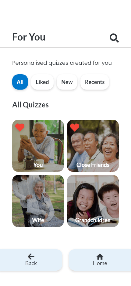
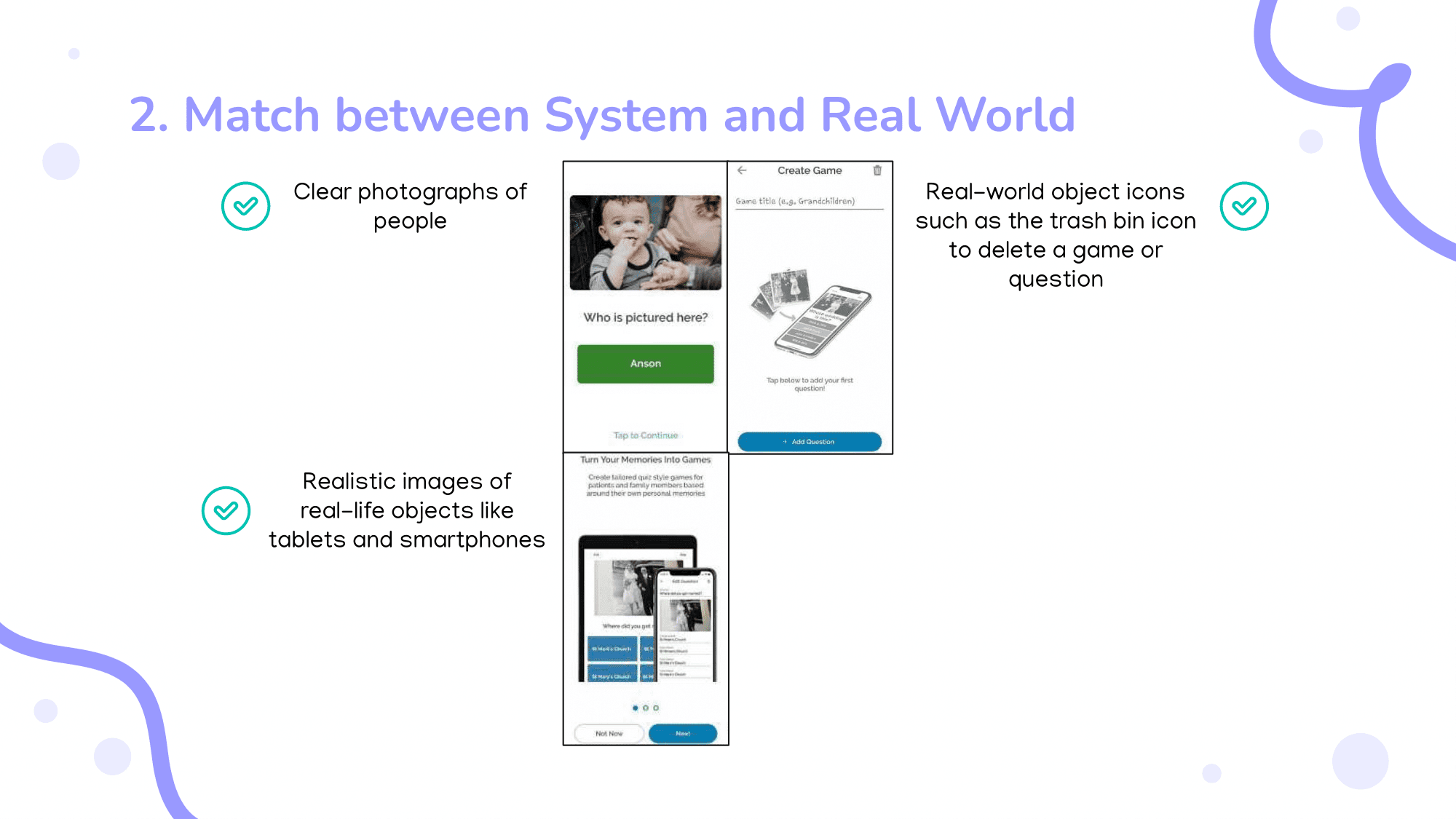
New UI


Conclusion
Working on this project was an eye-opening experience that taught me a lot about the user experience design process, from user research to usability testing. Though there were minor issues with the navigation of the final prototype, overall, people found the mobile application useful, functional, meaningful, and pretty fun.
Takeaways
Time management is key.
As the timeline is tight, I struggled to complete the project before the deadline. By breaking the project down into manageable tasks and getting started on them as soon as possible, I was able to meet the deadline.
Understand the priorities.
During the process of creating wireframes and low-fidelity prototypes, I made the mistake of focusing too much on the UI. Taking a step back and reassessing the user flows helped me to reprioritise the UX.
Always keep the target audience in mind.
Understanding the target user groups' needs is vital to make informed decisions during the design process, and ensure that the product will benefit them.